The situation
Some brands are a product with a story attached. This one is the other way around. Orgullo del Campo is about the people who work the Salinas Valley fields, and any site that opened with a product grid would be selling the wrong thing first.
The risk with a story-first site is that it becomes decoration. Parallax, gradients, motion for its own sake. That would undercut the subject rather than serve it.
What we built
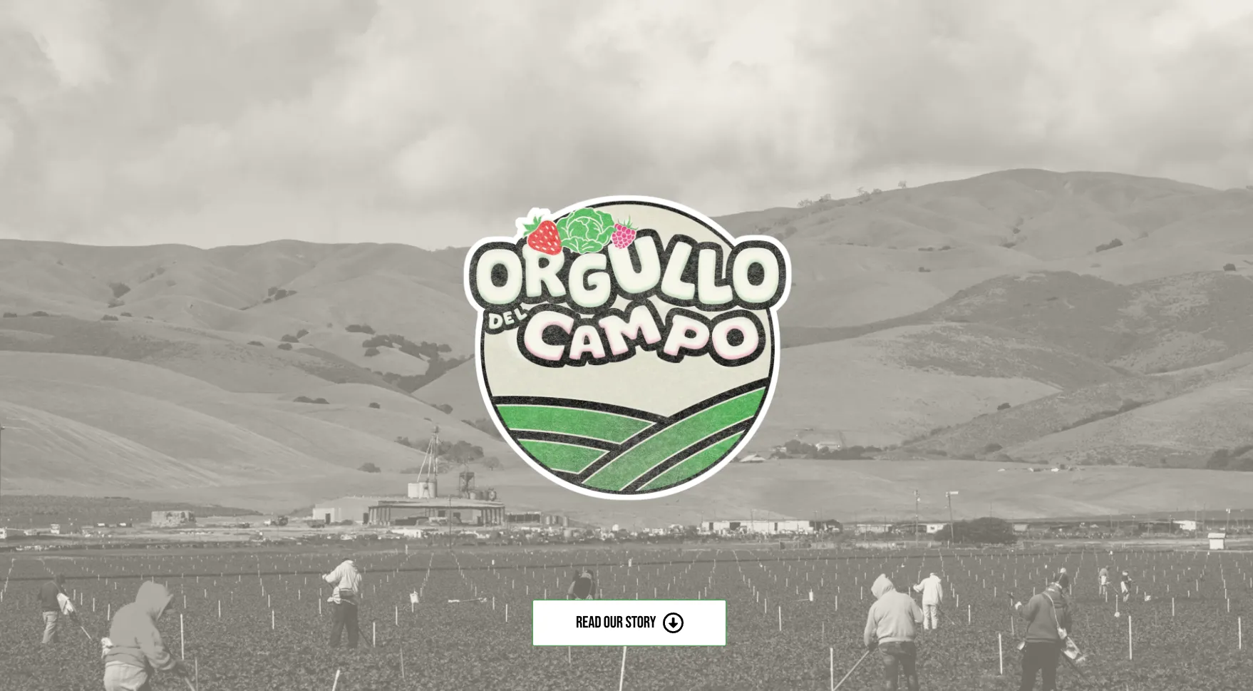
A first screen that does one thing.
- The field photograph held in black and white so it reads as documentary rather than as stock
- The logo as the only color on the page, which makes the brand mark the single point of focus without competing with anything
- One action, read our story, pointing down. No menu bar, no secondary calls, nothing asking the visitor to choose
- Real fields and real workers, not a symbolic image of agriculture
- The name carrying the argument. Orgullo del Campo does not need a tagline explaining it to the people it is for
What it does now
Someone landing here understands what the brand stands for before scrolling, and the only thing to do next is read the rest.