The situation
An event decorator is judged on taste. A client deciding whether to hire Bliss Balloons is asking one question, which is whether this person has the eye. A restrained, professional, neutral website answers that question with a no.
The usual advice, keep it clean and let the photos speak, is wrong here. The site itself is a work sample.
What we built
A site that behaves like the product.
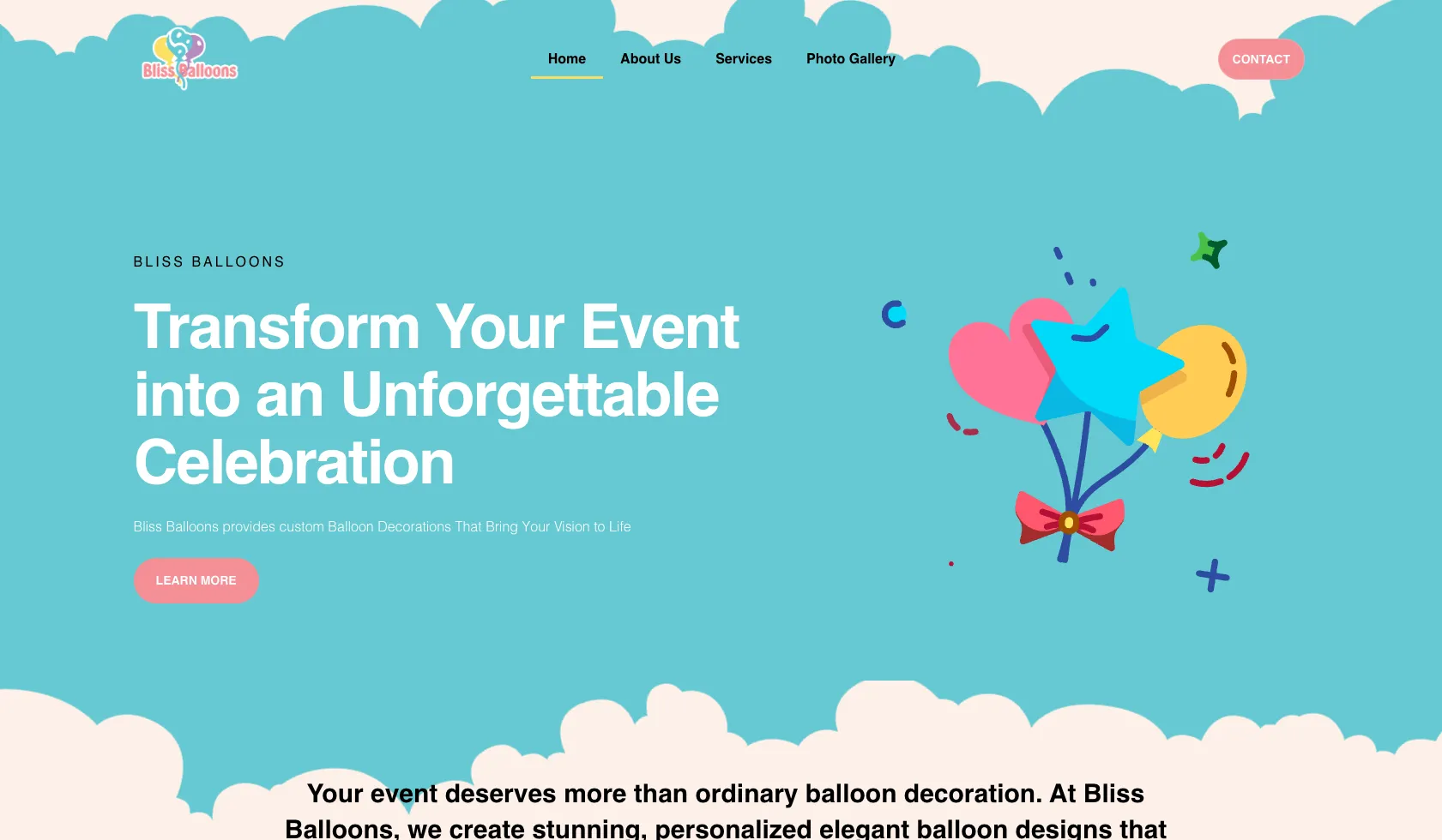
- The whole page committed to the palette, sky and cloud shapes, coral, gold, a soft cream, rather than a white page with colorful photos dropped into it
- Illustration in the hero doing the work a photo cannot, showing the shape language of a balloon installation without pinning the brand to one past event
- Photo gallery in the main navigation, since after the vibe check the client wants proof
- Services separated from the gallery, because a client booking a quinceañera and a client booking a corporate opening need to see themselves listed
- The promise written as the outcome rather than the deliverable, transforming an event, not supplying balloons
- Contact kept as a single warm action, since these bookings start as a conversation about a date
What it does now
The site passes the taste test in the first second, which for this business is the only gate that matters before anyone looks at a gallery.