The situation
Dog treats are bought by people reading labels. Someone whose dog has a sensitive stomach, or who is mid-training and needs something small and repeatable, is scanning for ingredients and for what is not in there. A generic store layout buries that under lifestyle photography and makes them go looking.
What we built
A store that puts the answer where the question is.
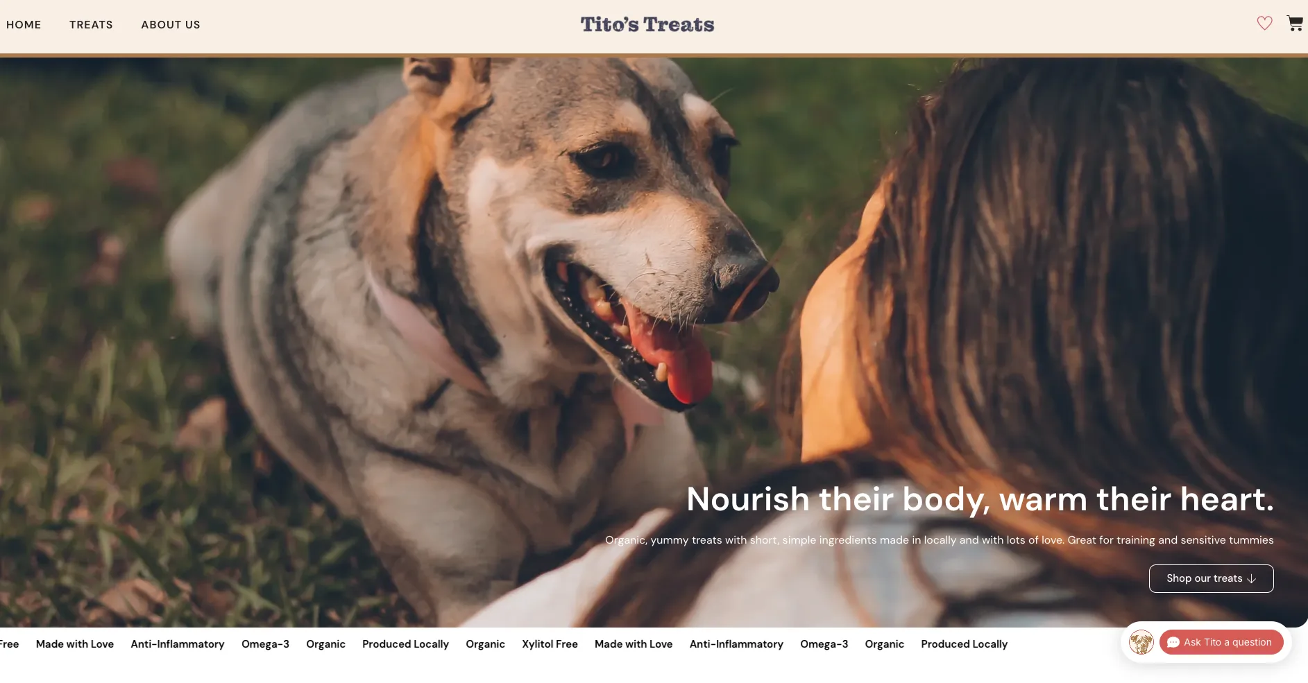
- The ingredient promise stated in the first line, not on an About page: short, simple ingredients, made locally
- A running band of the actual claims that matter to this buyer, xylitol free, anti-inflammatory, omega-3, organic, produced locally, so the scan finds them without a click
- Training and sensitive stomachs named directly, because those are the two situations that turn a browser into a buyer
- Product pages and a wishlist alongside the cart, since treat buying is repeat buying and people come back for the same one
- Ask Tito, an assistant on the page in the brand’s own voice, for the questions a label cannot cover: portion size, which treat for which dog, whether it suits a specific allergy
- Photography of a real dog, not stock, because this is a small brand and looking like a big one would cost it the thing it has
What it does now
An owner with a picky dog gets to the ingredient answer in one screen, and asks Tito the follow-up instead of closing the tab.